525 America
Redesigning a traditional brand to become digital-first.
It’s all about the sweater. 525 America has been creating high-quality, contemporary women’s knitwear since 1983. With roots in Brooklyn, they have a rich history anchored to 7th Avenue.
Role:
Brand Strategy
Creative Direction
UX Research
Responsive Web
Social Media Content
Project Management
Shopify Development
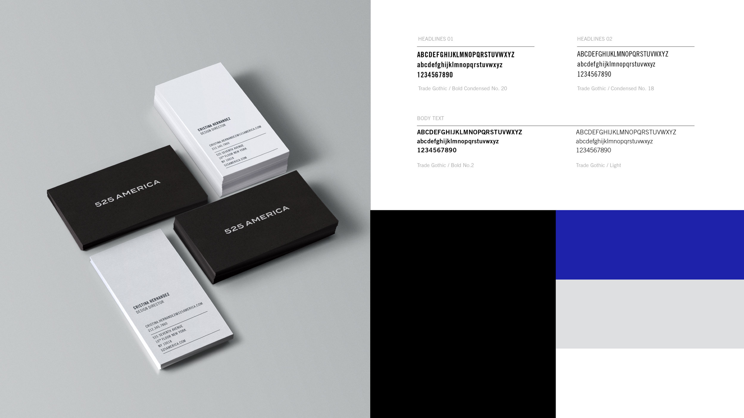
Unified Theory was engaged to refresh the brand and eCommerce experience to better reflect the company heritage in a modern age. Under the theme ‘Born in Brooklyn’ and drawing inspiration from vintage New York billboards, street signs, and store-fronts, the result is a custom-crafted typographic mark and minimal identity reflective of an established brand that is markedly New York.
The demographics of 525 America skewed to an older audience, and our challenge was to design a contemporary brand and website that would not only live well within the competitive landscape, but also appeal as relatable and approachable to younger audiences while still retaining interest from their core customers.
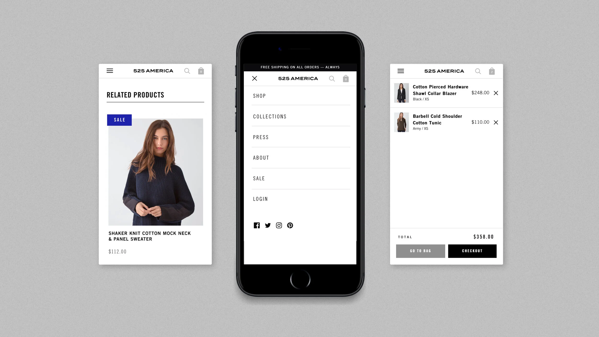
The previous website was largely a desktop-only experience. While customers among 22 - 30 years old spent more time on the site, conversions were low. The majority of sales were made in brick-and-mortar stores by older women. The new custom Shopify site is fully responsive across devices, ensuring both a wider demographic receives the same quality experience online, making it easier to complete purchases wherever they are.
Through brand workshops with the senior stakeholders, we helped define the brand story, goals for the new brand, and identified and researched the competition through perceptual mapping of brands in the same market.
Through defining a common language that the client could use to describe the brand, including who the company was, what they do and why they do it, we honed in on characteristics and attributes around the brand. This served as our north star, informing all brand work going forward.
Scalable Grids
We created a flexible system to be used across all marketing materials, with logotype and text lock-ups flexing to the various applications. Looking to the history of New York itself for typographic inspiration, we pulled references from vintage billboards, street signs and store-fronts. Pairing our newly-crafted mark with the classic Trade Gothic typeface, it contrasts with the wider logotype letterforms.


