Citizens Financial
Scaling a cross-platform, consumer banking experience.
Citizens Bank is one of the oldest and most prominent financial institutions in the Northeast. Headquartered in Providence, Rhode Island, they deliver a broad range of financial services to over five million individuals, companies, non-profits, and institutions. We overhauled their entire banking experience.
Over the course of 3 years, I led cross-functional teams across client engagement, design, UX, prototyping, and development, which included the Android and iOS mobile banking apps, a responsive banking website and various other digital marketing initiatives.
Through an ongoing relationship, we provided Citizens Bank with design and UX enhancements on a regular basis, across their online and mobile banking applications.
What we heard
When embarking on the research phase of the project, we leveraged existing user testing studies from the previous year before the engagement started with Citizens, we heard feedback that users struggled to pay bills or transfer money, they were looking for additional information – such as having banks separated from ATMs, and they also wanted to be able to search branches by city or town, as they may not always know the zip code of their destination.
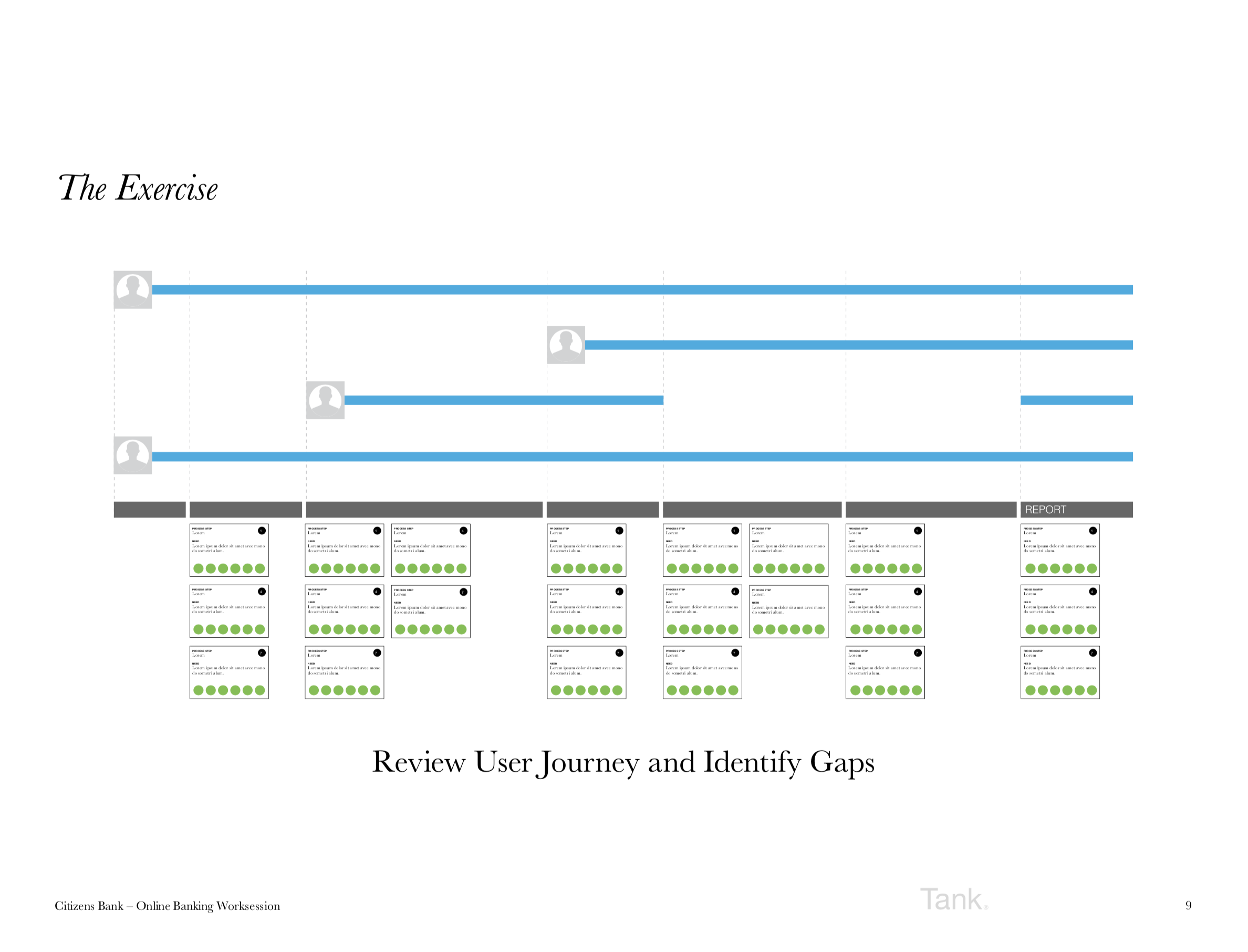
Through continuous collaborative workshops, stakeholder meetings, qualitative research (User testing 1:1 sessions), heuristic audits and UX research, we gained valuable insight into user-needs while working through the creative process. From here we explored some high-level design principles to map to the customer pain points:
Simplify navigation across the app and website
Enhance the way customers interact with payments, transfers and accounts balances
Create a consistent visual system across iOS, Android, and the responsive site.
Identify new features to build and modernize the system
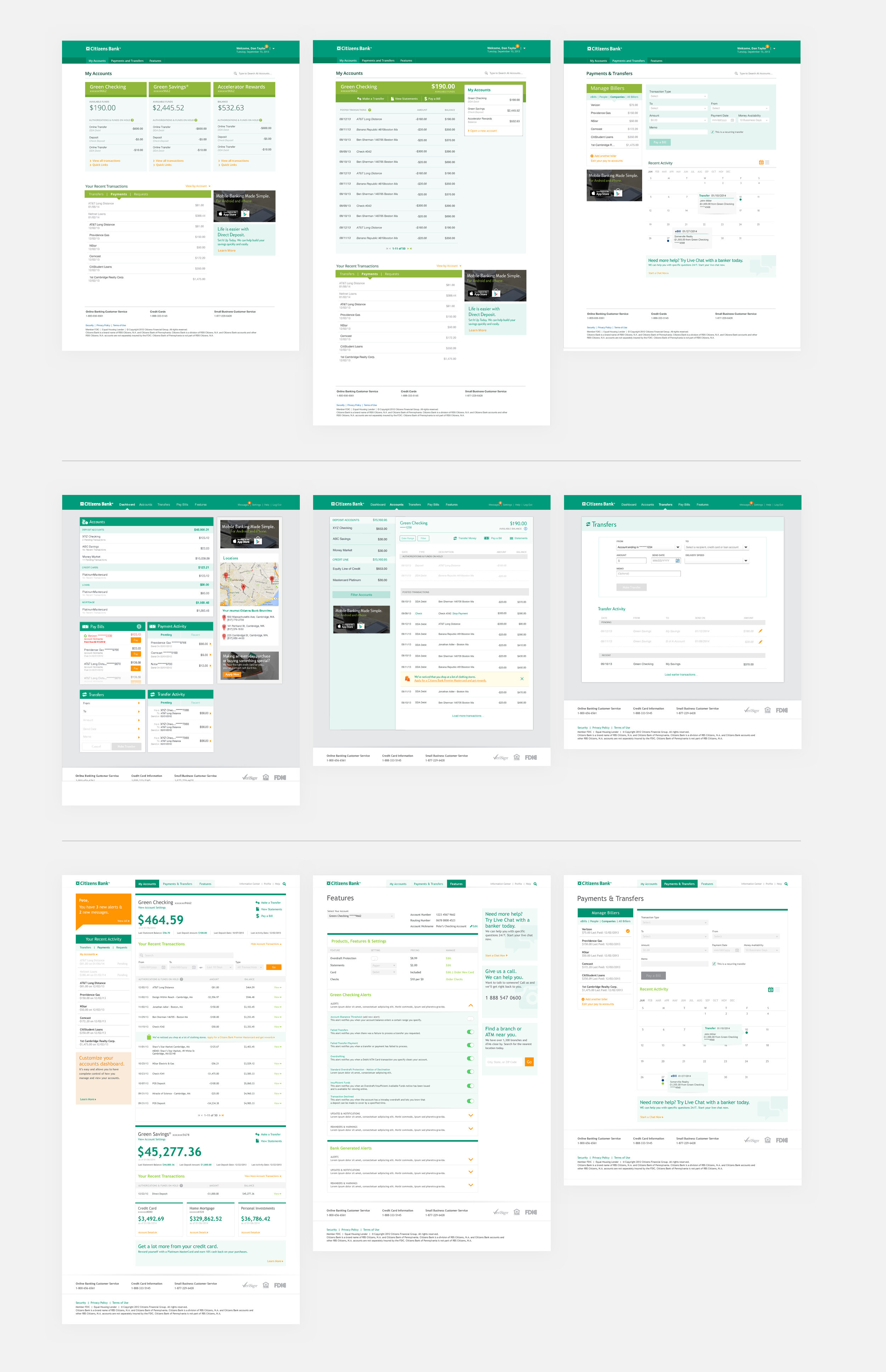
Online Banking exploration
Final Design Direction
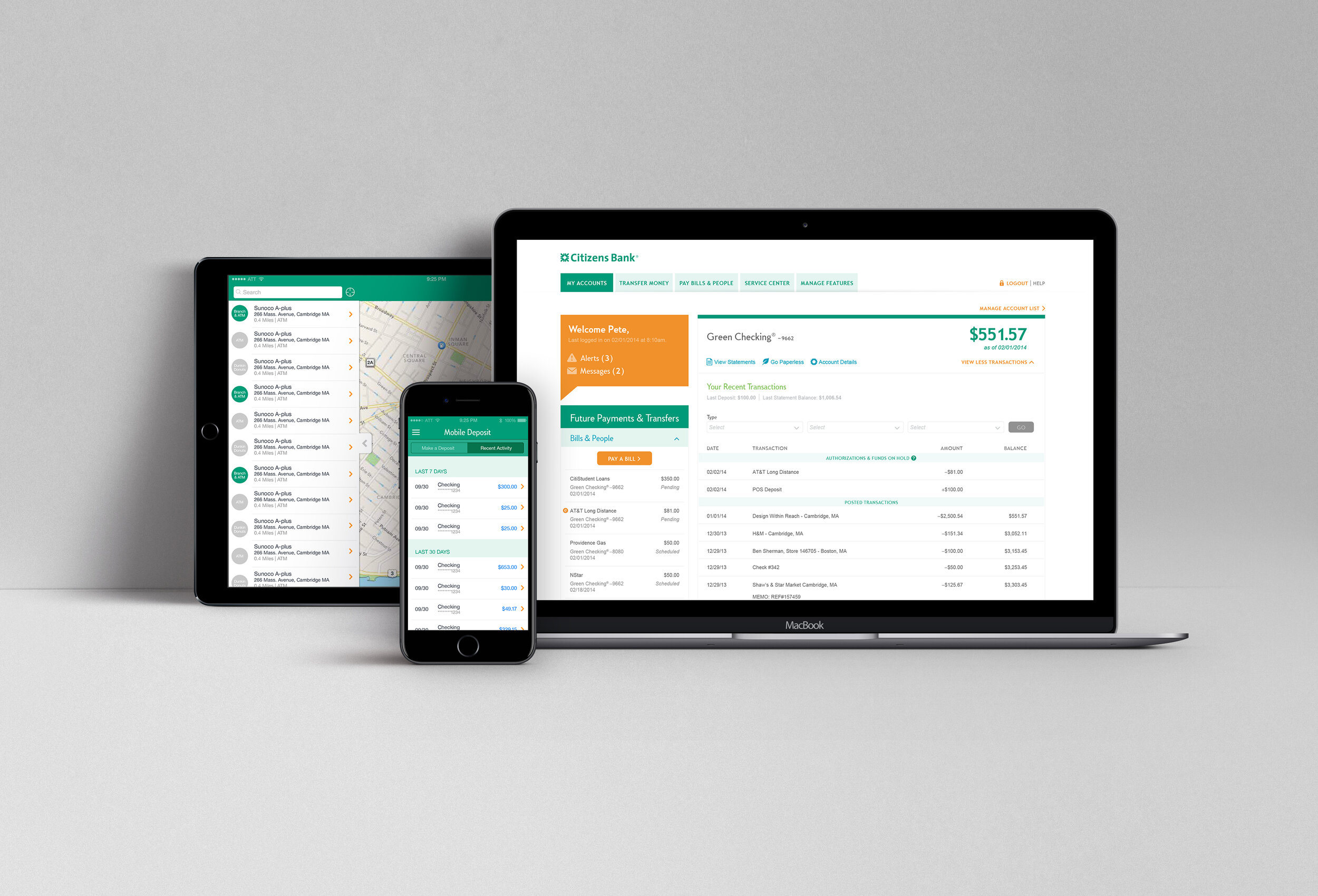
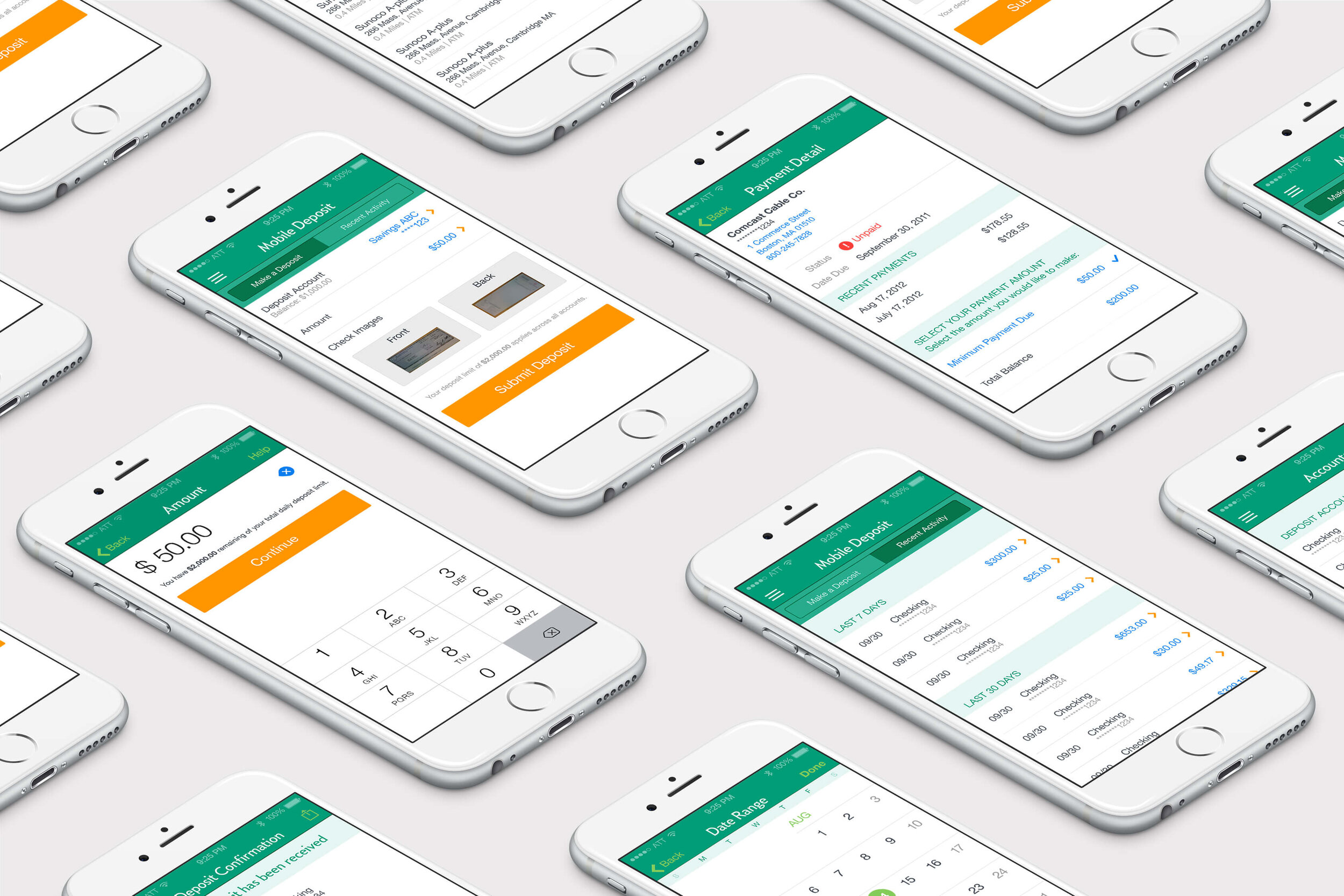
Mobile App: Accounts, Check deposit, Date and ATM search
New Features
With iOS7, Apple’s largest update to their mobile OS came an opportunity to introduce new features like Pop Money for faster transfers, Fast Balance, and Mobile Check deposit.
Design System
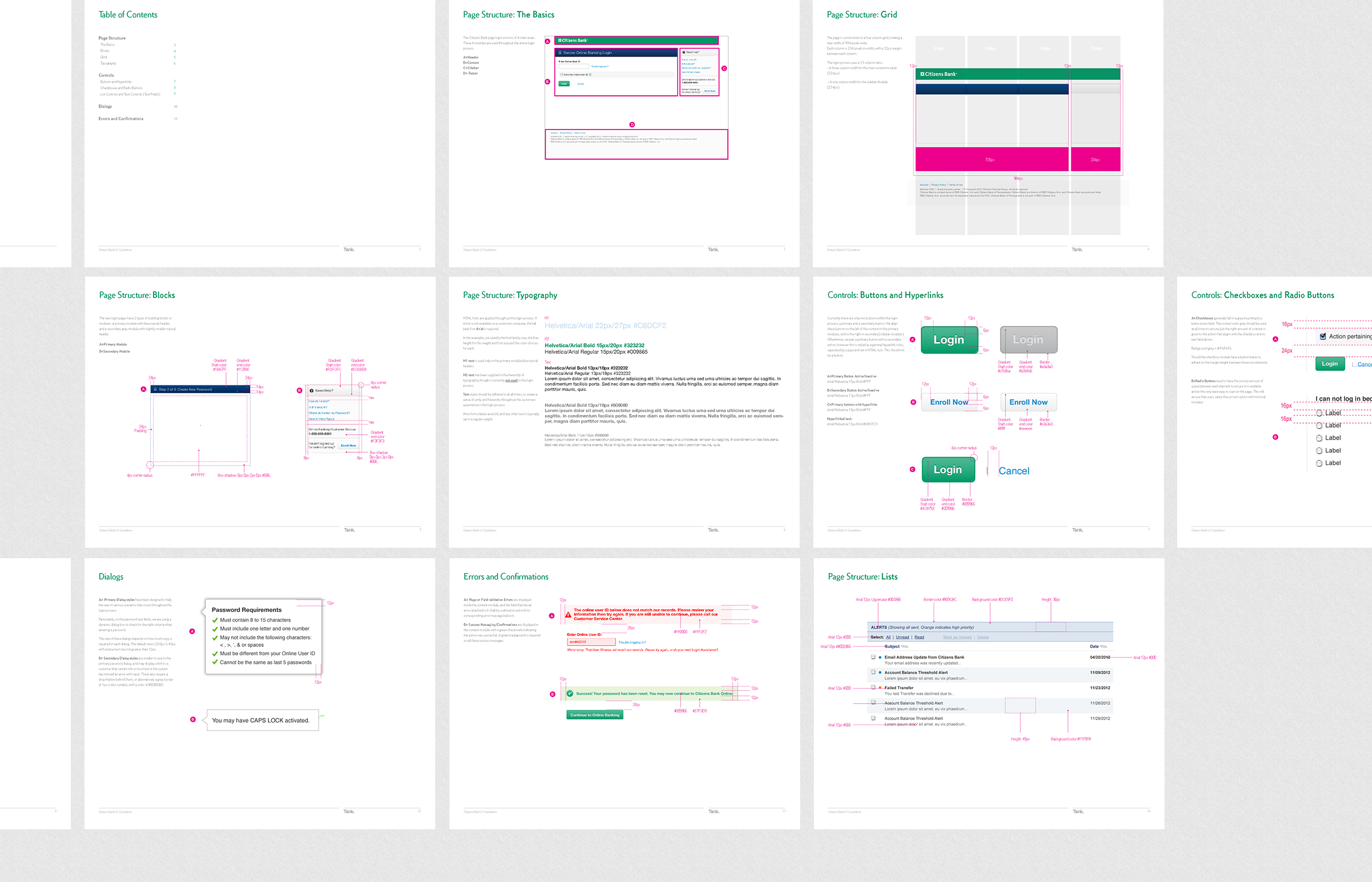
By significantly reducing the number of legacy design elements and functions from the previous interface, we streamlined our UI patterns into their first fully scalable design system and build kit. This makes it easier for developers to integrate future changes without the need to create new components unnecessarily.
By identifying initial quick wins to enhance the design through user research and testing, we also identified areas of functionality we could roll out across the desktop experience in a phased approach. We developed UI patterns, low and high-fidelity prototypes, and user testing models that maintained consistency and added efficiencies to streamline design processes. Guidelines and design systems were created for the design team, developers, and vendors to inform a holistic visual language between marketing materials and the digital customer experience. We needed to create a design that could flawlessly and flexibly adapt to feature changes as technology evolved and features were added.
Role:
UX Strategy
User Research & Audits
Workshop Facilitation
Usability testing
Wireframing
Prototyping
Product Design
Responsive Web
Creative Direction
Agency: Tank
Creative Direction: Justin Hattingh
Design: Elanie Blais, RJ Foley, Justin Hattingh, John Hemminger, Jen Magathan, Caley Ostrander, Juliana Press
UX/Strategy/Testing: Jen Dadagian, Cara Guappone, Justin Hattingh, Karalyn Klepper, Evan Smogor
Engineering: Nick Braica, Niraj Shah
Account Manager: Karalyn Klepper

